Seasoned filmmakers know that colors are a tremendously powerful tool in their visual kit. Even if you’re just starting out, it’s an essential thing to learn and utilize in your workflow because grading is not only there to make your images look nice. Used correctly, it can support storytelling, create the right mood, affect viewers emotionally, and also draw their eyes to where you want them to look. And that’s exactly what we’re going to talk about here – how to guide the viewer’s attention with color.
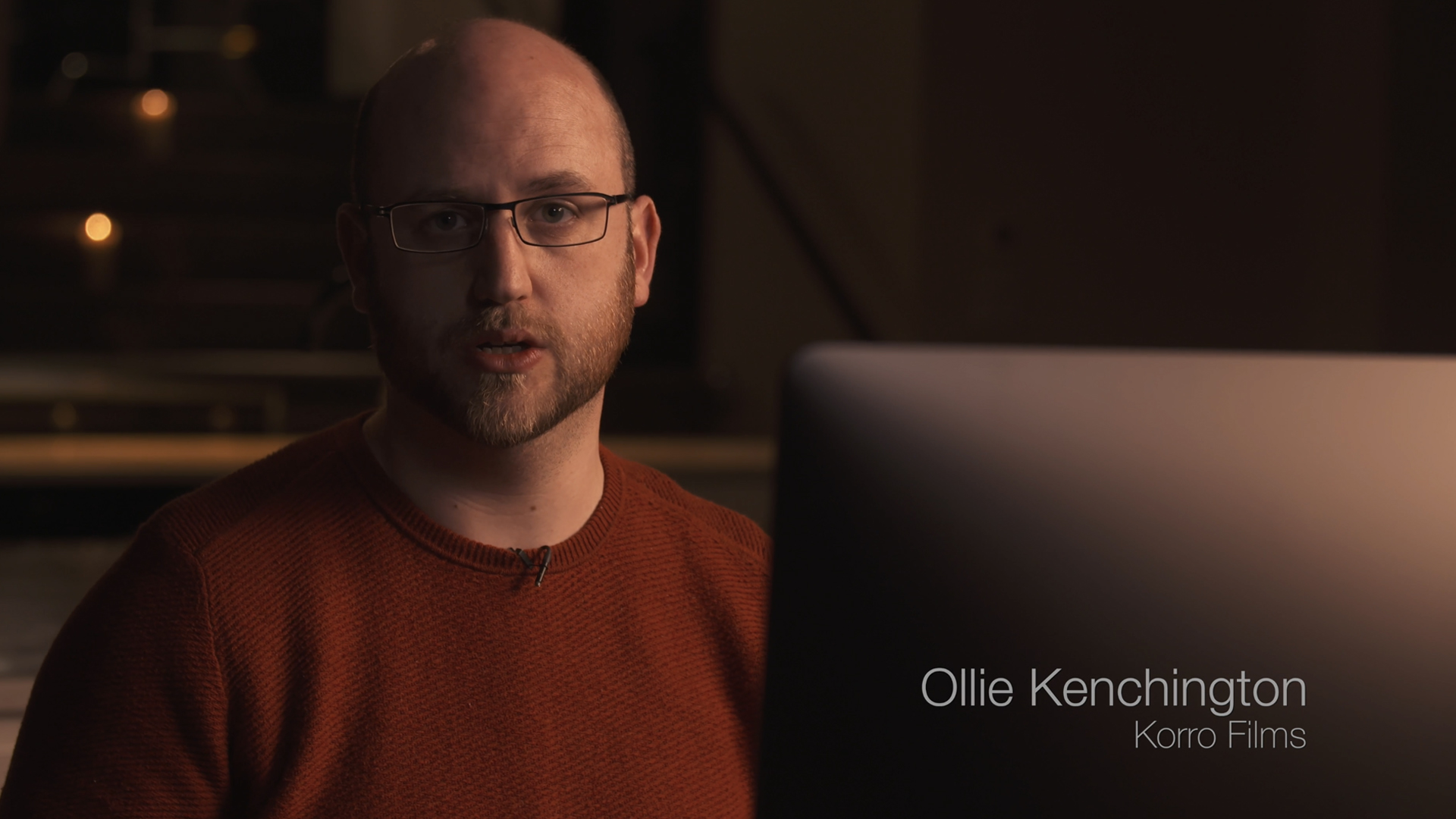
To support us, there are quite a few lessons on this topic in Ollie Kenchington’s MZed-course “Directing Color”. As an industry professional and the founder of Korro Films, Ollie carries out senior editor and colorist duties on every project. In this masterclass, he not only introduces the creative grading process in filmmaking but also explains how to use it far more deeply and thoughtfully. Below, we share some of his insights on guiding attention with color.
If you want to watch his class in full, head over to MZed.com.
Why is contrast so important?
The first thing every colorist focuses on after obtaining the footage is the contrast. But why is it so important? Ollie Kenchington’s explanation traces back to our perception. Film, photography, and pictures are all two-dimensional media that we view on flat screens, TVs, or canvases. At the same time, as filmmakers, we strive to make viewers feel like they are part of a three-dimensional scene. Our goal is to immerse viewers and capture their full attention as they engage with what they are watching. And the most simple and common trick to achieve this goal is to add shading.
By adding the shading, I’m saying to you: trust me, this 2D circle is, in fact, a representative of a three-dimensional object, a sphere.
Ollie Kenchington, a quote from MZed-course
Shade adds contrast to subjects, objects, or whole scenes. It’s part of the visual language we digest and understand from an early age. This aspect also contributes to achieving depth of field in our images. Of course, a lot of the contrast work can (and should!) be done on set by setting the correct lighting, creating the key and fill sides, and paying attention to light and dark parts of the frame. However, oftentimes (especially in corporate video productions), there is no time for it, and/or you have to adapt to its extensive spillage throughout the environment. In such cases, color grading comes in handy.
Creating depth of field to guide the viewer’s attention with color
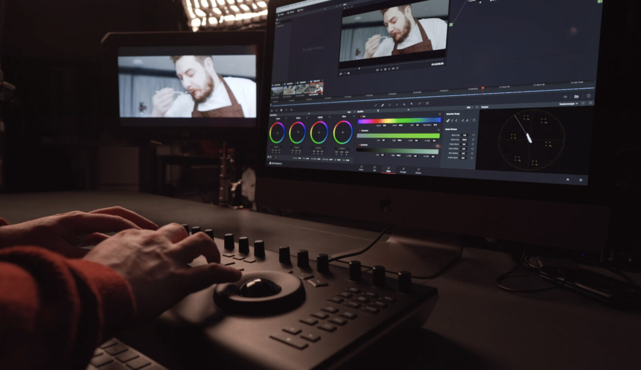
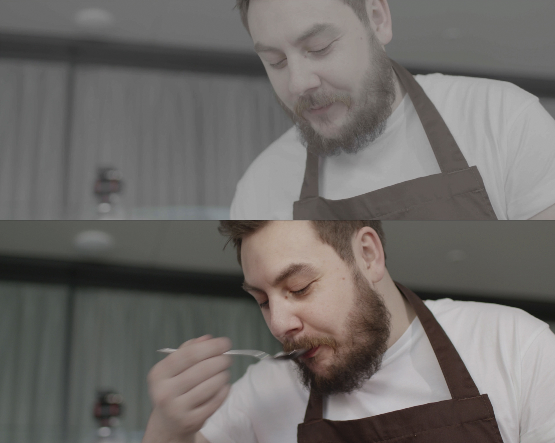
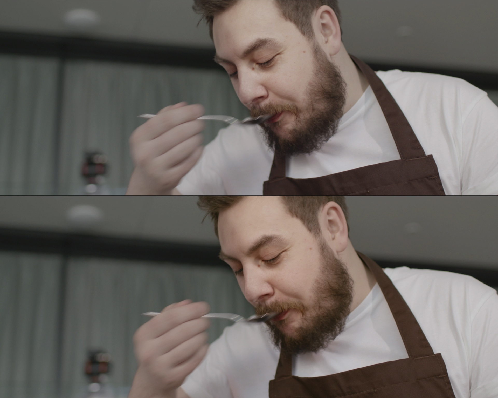
Ollie shows us the process of creating depth of field and directing the viewer’s focus toward a scene example he filmed for a video ad. There was no time to set up contrast lighting, so the image appears relatively flat and evenly lit at first (we have attached the raw version below). After going through basic contrast adjustment, Ollie concentrates on the relighting of the protagonist’s face. In the software of choice (DaVinci Resolve in this case), you can create a mask by selecting the furthest part of the face (drawing the dividing line along the nose) and then darkening and desaturating it slightly. But be careful! Only subtle iterations, otherwise the result may look ridiculous.
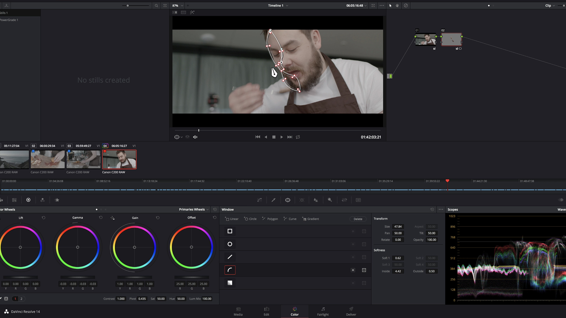
In fact, in the newer version of DaVinci, there is an AI-based relighting function that can do this task for you. We wrote about it here. Regardless of how and where you do it, the next step would be to select the area you want to be in focus and add extra contrast. According to Ollie Kenchington, it is one of the simplest yet most impactful techniques to guide the viewer’s attention precisely where you intend. In the scene example, it’s the main character. What do you say to the following before-after comparison?
High contrast draws the eye
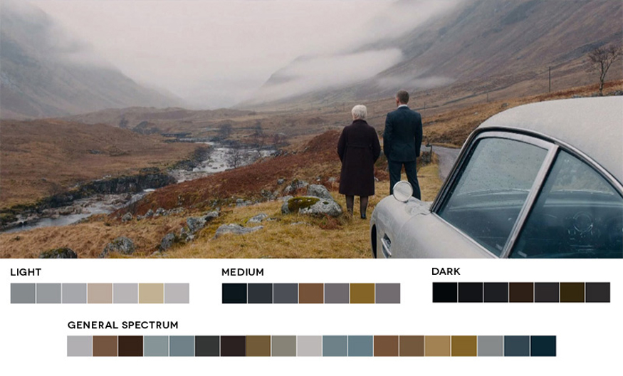
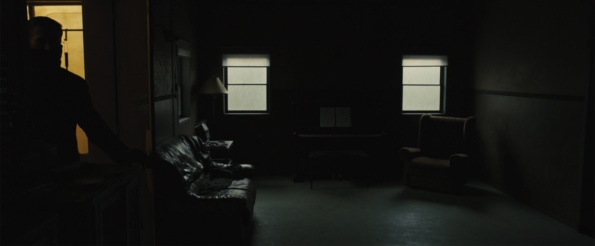
The higher the contrast, the more it helps to guide the viewer’s attention. A brilliant example, in Ollie’s opinion, is the Netflix series “The Crown”. One of its signature features is large spaces such as in palaces where the queen appears quite small within the frame. But even in those cases, the main attention is driven toward her, like in the example below. What helps to achieve this effect are huge windows providing natural light, either from the side – building high contrast on the character’s face – or from behind, putting their silhouettes directly in the viewer’s focus.
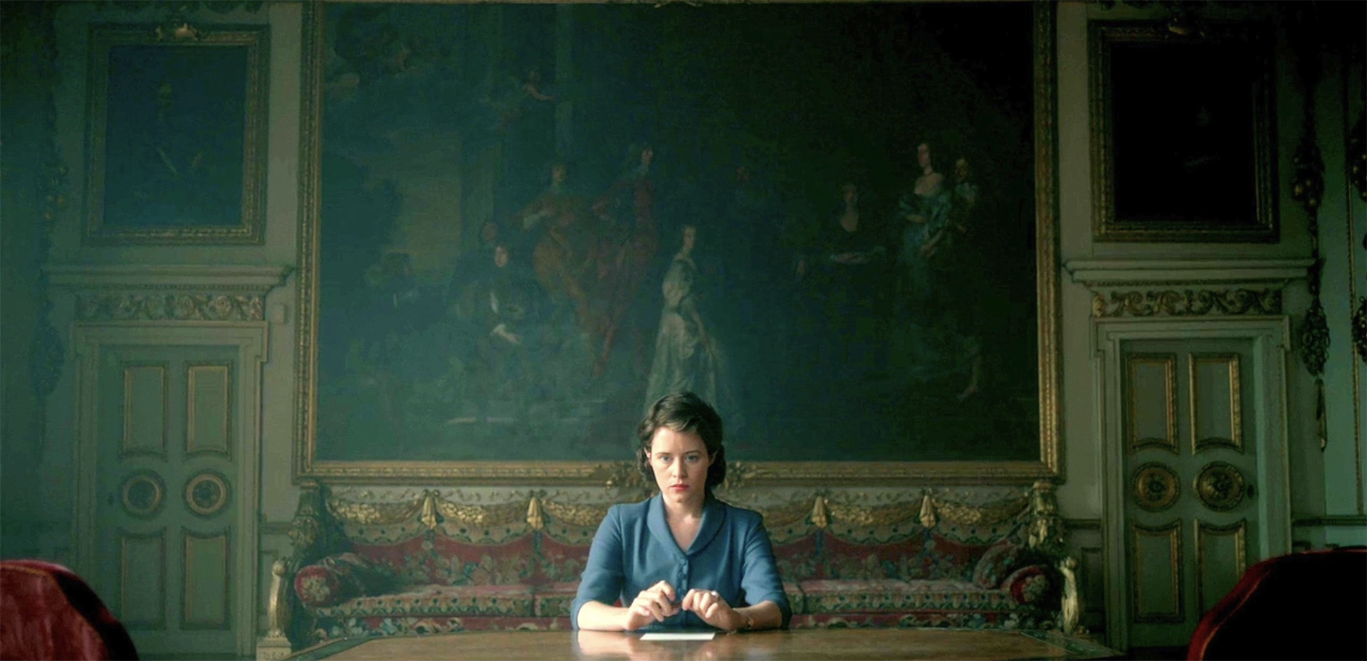
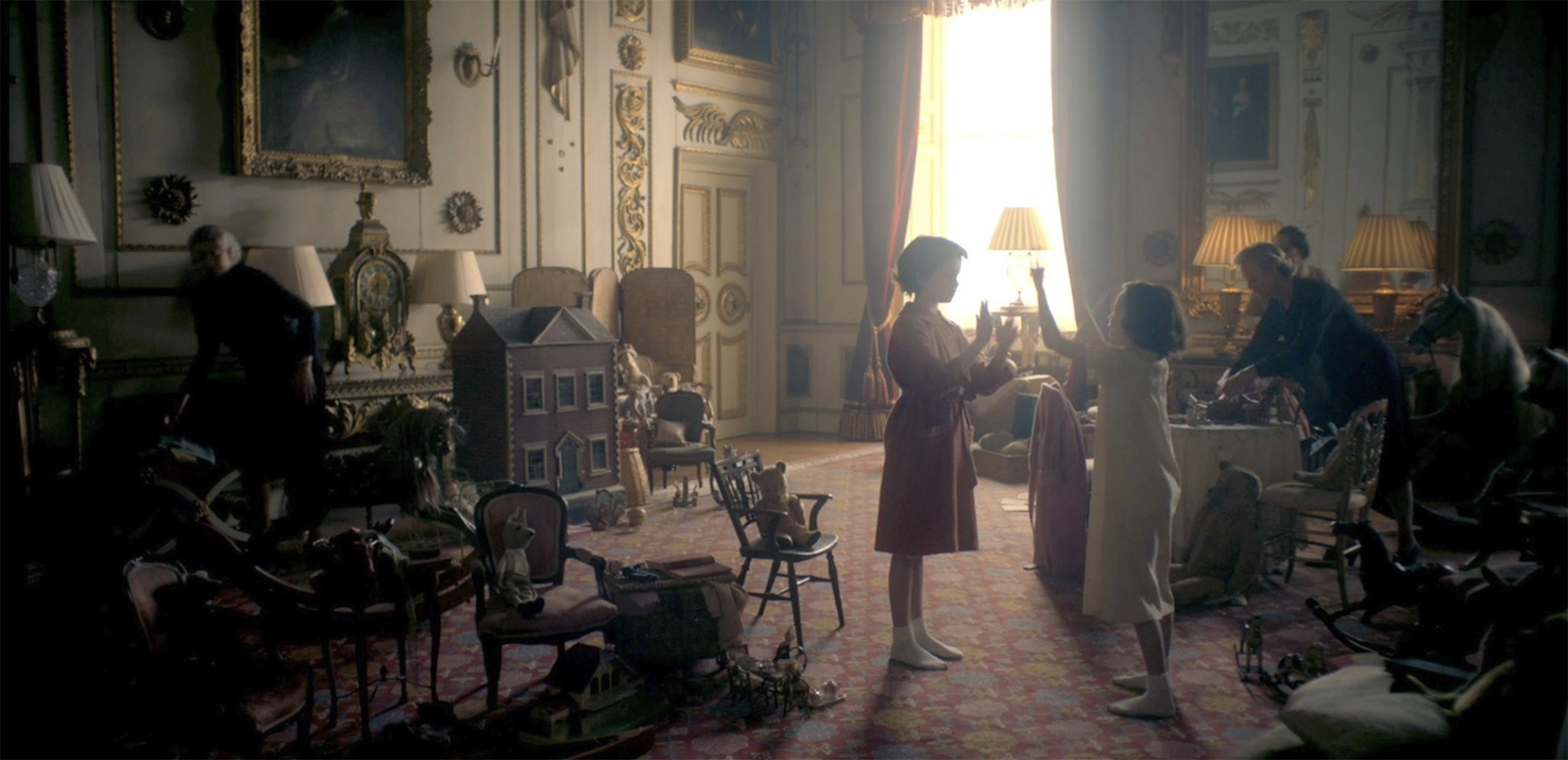
Of course, that’s a collaborative accomplishment involving various departments – camera, production design, lighting, etc. But colorists also play an important role here. They have the potential to enhance on-set work and even add additional meaning to it.
Choosing the right palette
For example, they can do it with subtle color adjustments, and that’s another practical trick from Ollie Kenchington. If you have a grasp of color theory, you may be aware that different colors attract varying levels of attention from us humans (if not, you can read about it here). Blue, for instance, naturally appears distant to our eyes because we have learned to overlook it. In contrast, warm colors and skin tones capture our attention and appear prominent. So, by deliberately choosing and applying a specific palette, we can create depth with color and set points of attention within the frame.
Let’s come back to our scene example. Here, Ollie inverted the subject selection, which he used to tweak the contrast, smoothed the mask, and pushed a bit of blue into the background area. It’s nothing dramatic, very slight changes, but look at how it works! There is even more depth of field in the scene because of the color contrast. And thanks to our knowledge of color perception, the most important subject is definitely prominent now.
Another simple trick – saturation
But what if you have a lot of similar competing elements in the frame, and you want to draw the viewer’s eye to only one of them? Like in the shot below? In this case, Ollie recommends we start with contrast and then use saturation. Meaning: mask the area that needs to stay in focus (the hand with the knife over the blood orange), invert the selection, lower the contrast, and afterward slightly mute the “outside” colors as well.
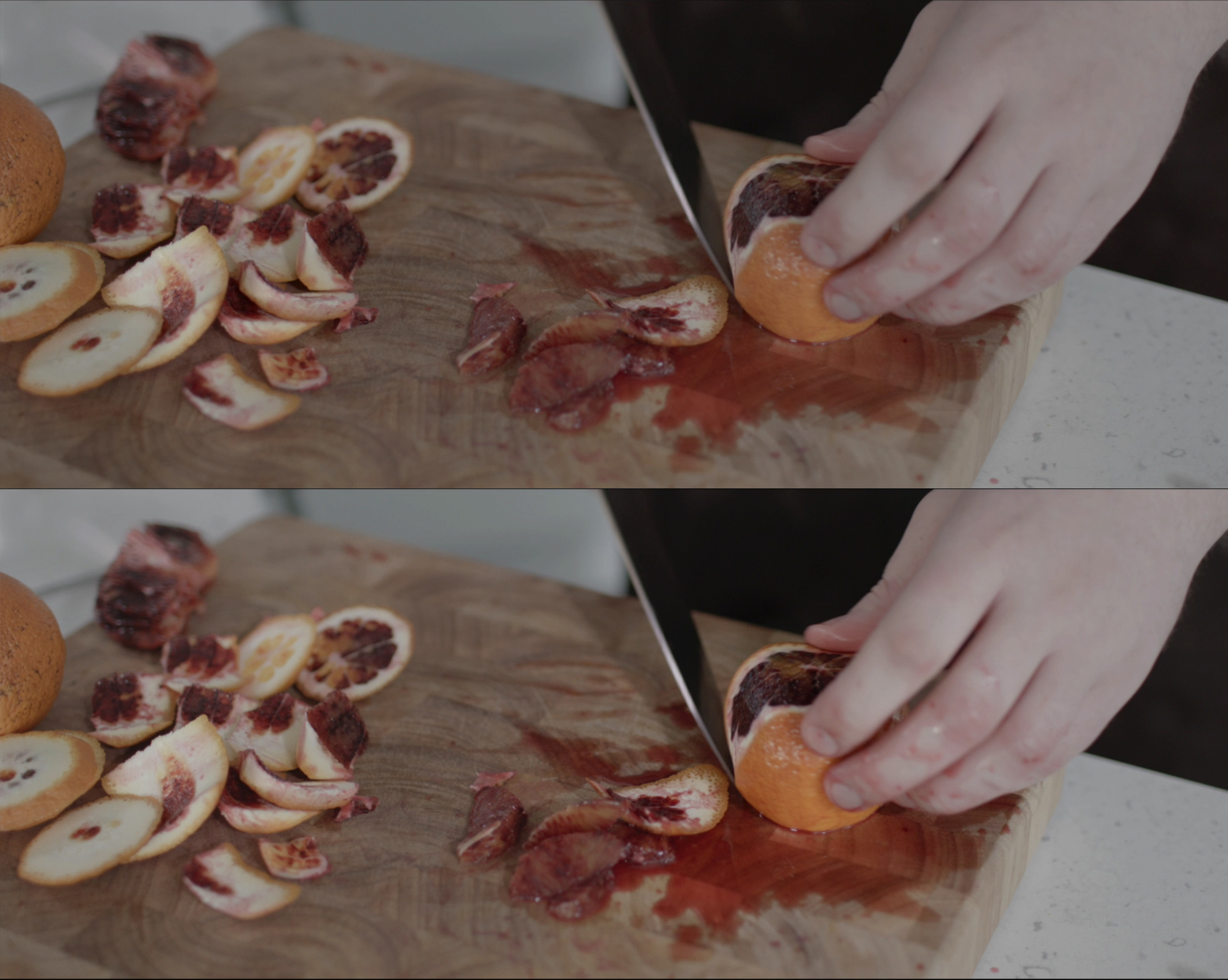
What this simple, tiny saturation tweak does is convey the important elements of the frame to the viewer. Curiously enough, this tool also works in very original scenarios. As an example, Ollie Kenchington shows us the following shot from “Blade Runner 2049”.
Take a look at this composition. It’s not a harmonic or natural one, and the DP Roger Deakins knows that for sure. He also knows that silhouetting Ryan Gosling and adding a vivid yellow color to his background will direct the viewer’s gaze to him, even to the edge of the frame. By using imbalance as a tool to impact our emotions, and the choice of color, which appears unpleasant, even toxic, filmmakers not only manipulate our attention but also tell a story with it.
Color as a storytelling tool
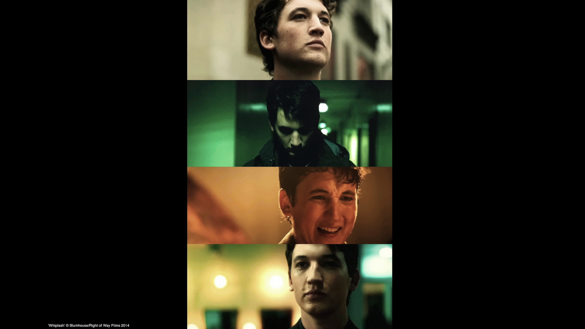
This leads us to the next level of color grading, and the most exciting part – conveying mood and eliciting emotion with color. Ollie Kenchington explains its effectiveness in the example of “Whiplash”, where four distinct looks take us through the narrative and support the emotional journey of the film’s protagonist, Andrew. If you want to know the significance of the noxious green color in the young drummer’s story or the profound meaning behind the use of a specific orange hue in the film’s theme, head over to watch the whole course “Directing Color” on MZed.com.
So what do you think? Are there any other tips to guide the viewer’s attention with color? How do you incorporate them into your video projects? Let’s talk in the comments below!
What else do you get with MZed Pro?
As an MZed Pro member, you have access to over 300 hours of filmmaking education. Plus, we’re constantly adding more courses (several are in production right now).
For just $30/month (billed annually at $349), here’s what you’ll get:
- 50+ courses, over 750+ high-quality lessons, spanning over 400 hours of learning.
- Highly produced courses from educators who have decades of experience and awards, including a Pulitzer Prize and an Academy Award.
- Unlimited access to stream all content during the 12 months.
- Offline download and viewing with the MZed iOS app.
- Discounts to ARRI Academy online courses, exclusively on MZed.
- Most of our courses provide an industry-recognized certificate upon completion.
- Purchasing the courses outright would cost over $8,500.
- Course topics include cinematography, directing, lighting, cameras, and lenses, producing, indie filmmaking, writing, editing, color grading, audio, time-lapse, pitch decks, and more.
- 7-day money-back guarantee if you decide it’s not for you.
Full disclosure: MZed is owned by CineD.
Feature image source: Ollie Kenchington / MZed.